Motorcycle gear / Ecommerce design
Braapking
A storefront for the way you ride.
An adventure rider and a daily commuter may both need a helmet. They do not start with the same questions. The Braapking storefront gives each rider a way into the range, then brings the product details into focus.
Visit Braapking preview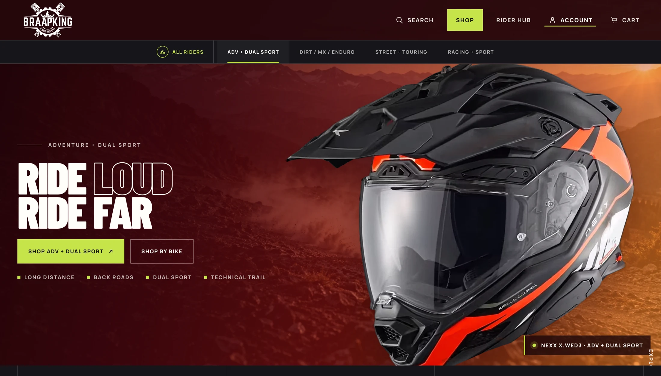
- The brand
- Braapking
Motorcycle gear and parts - Design focus
- Category navigation, bike fit, product comparison, and buying guides
- The experience
- Choose your ride.
Find the gear. Check the details.
The design brief
Give the rider
a place to start.
A rider might arrive with a product in mind, a bike to fit, or a trip to prepare for.
The storefront makes space for all three. Riding categories introduce the range, the fit finder begins with the motorcycle, and buying guides help someone work out what to look for.
The design challenge is to keep that choice useful. Each route should lead toward a smaller, more relevant set of products.
Finding the right starting point
Shop the ride.
Then the gear.
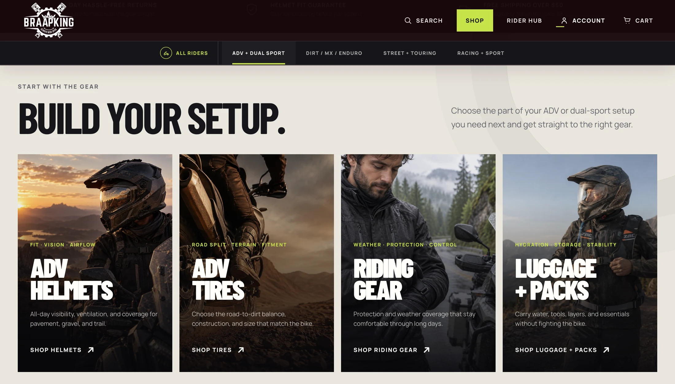
The category introduction puts adventure helmets, tires, riding gear, and luggage within reach. Large photographs give each category a recognizable use, while short labels keep the choices easy to scan.
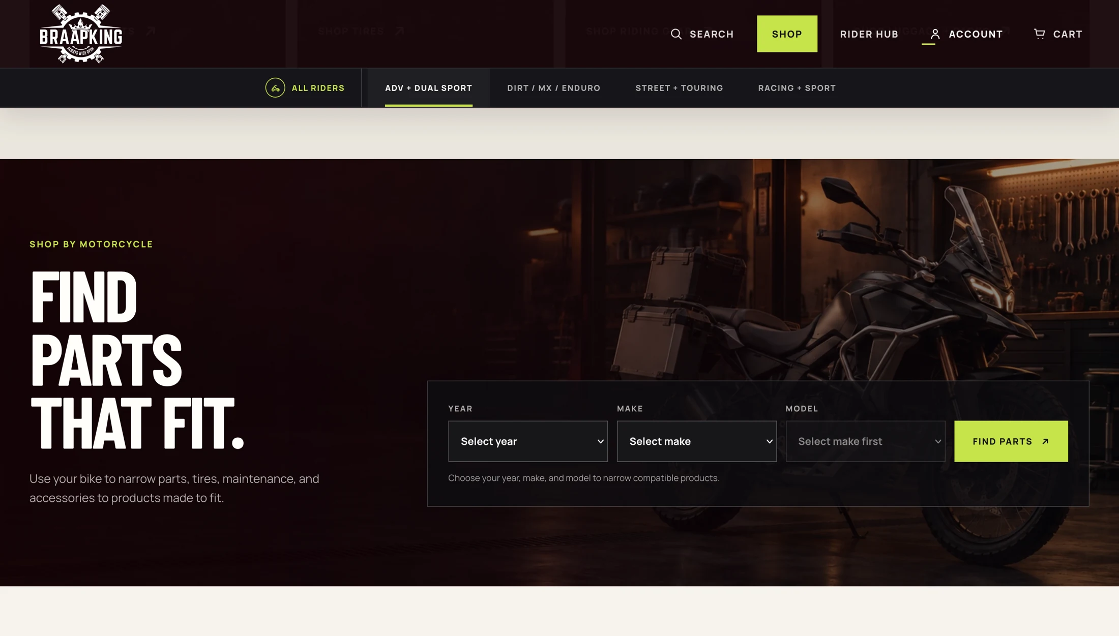
For parts, the starting point changes. Year, make, and model fields give the rider a way to narrow the search around their bike.
Art direction
The product
takes the lead.
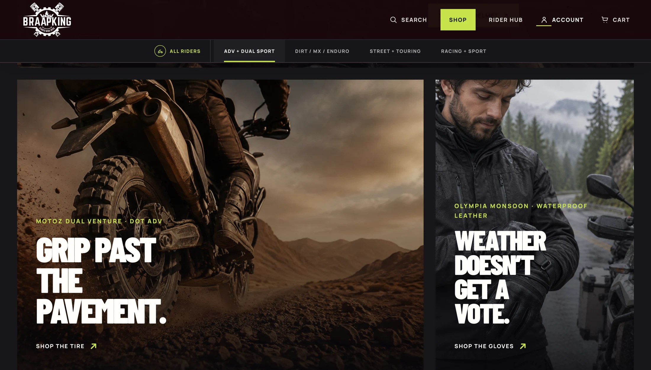
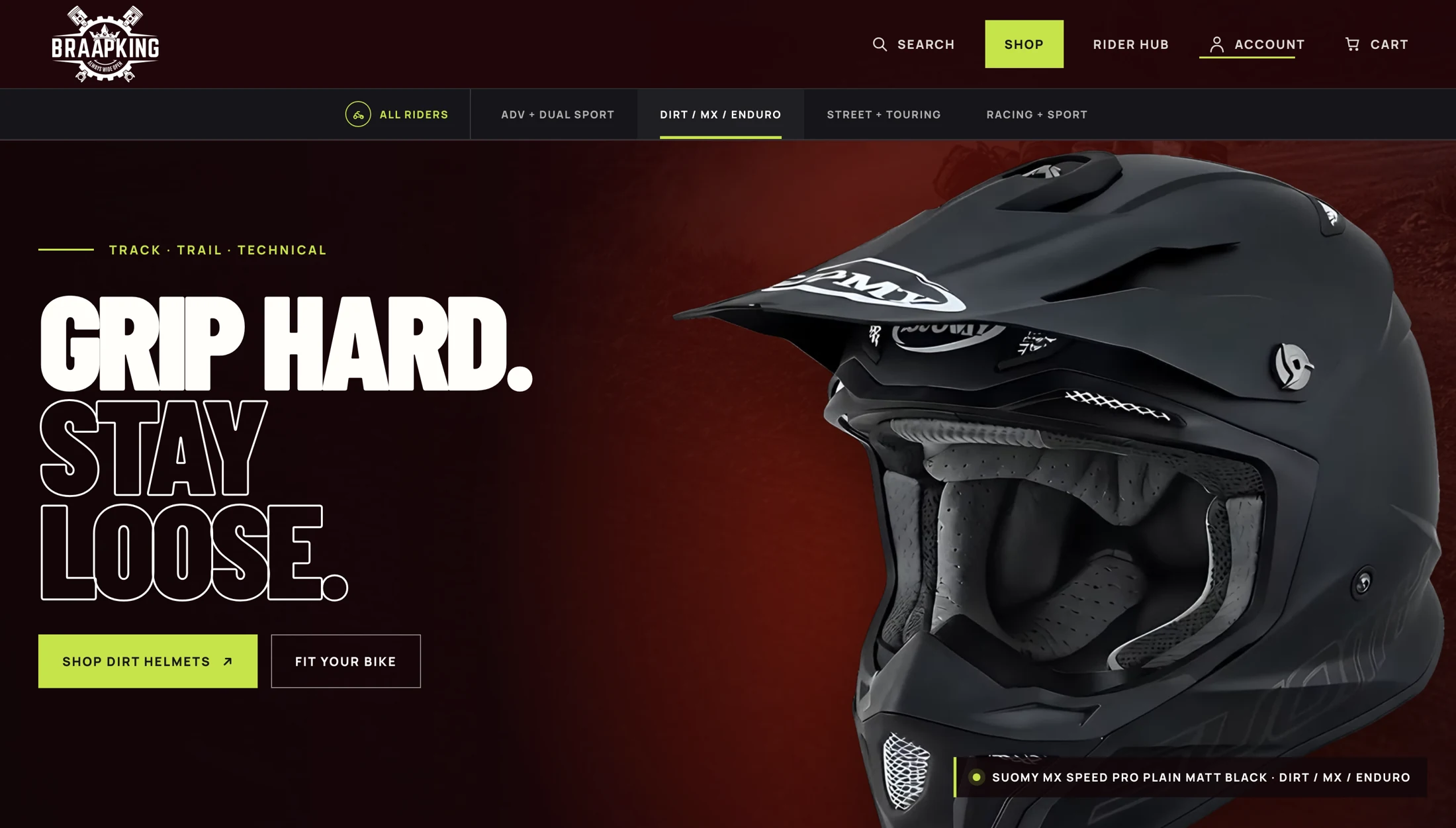
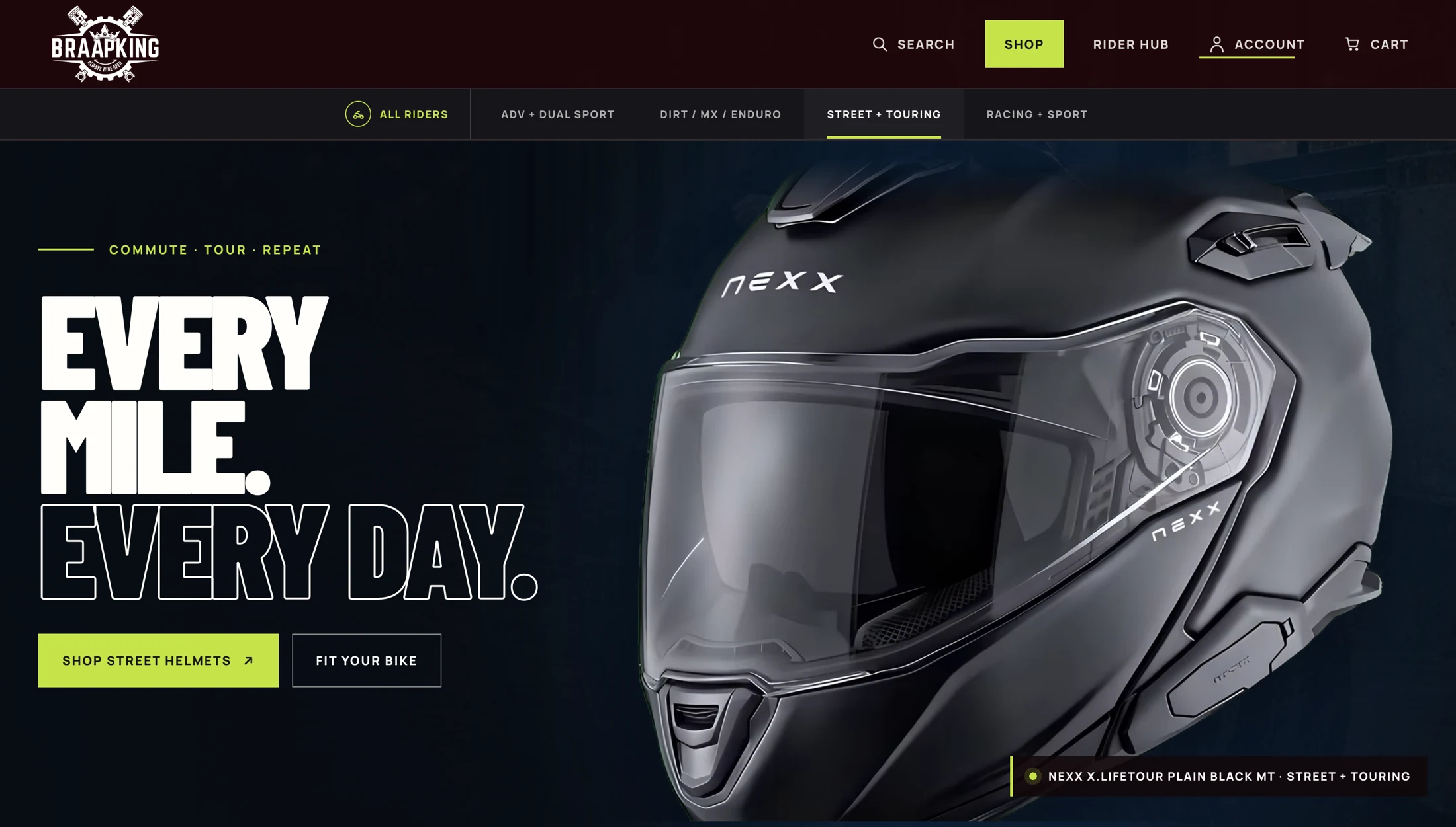
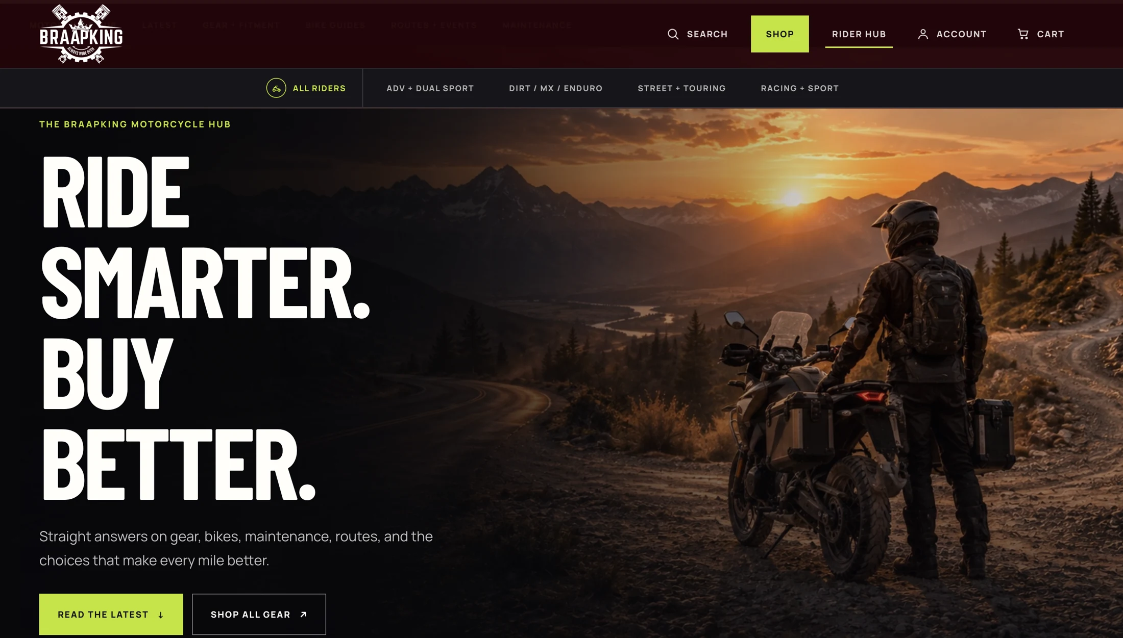
Oversized helmet photography, condensed type, dark surfaces, and sharp yellow-green buttons give the store its voice. The product stays large enough to inspect, even when the headline is loud.
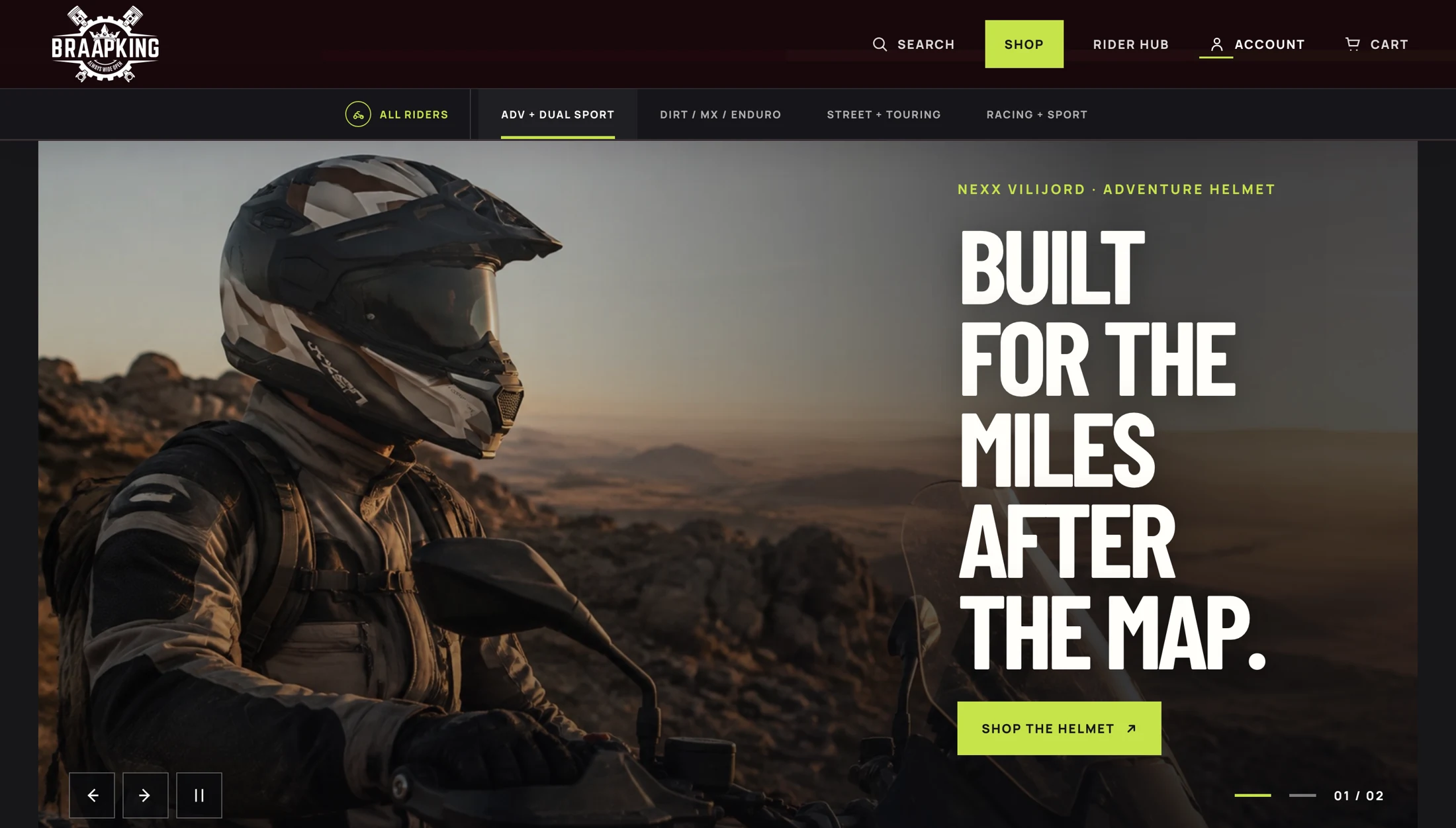
Riding imagery then puts the gear back in context: a long-distance route, rough ground, or a change in weather. Each feature pairs that setting with a shop destination.
Different riding needs
A shared system.
A different emphasis.
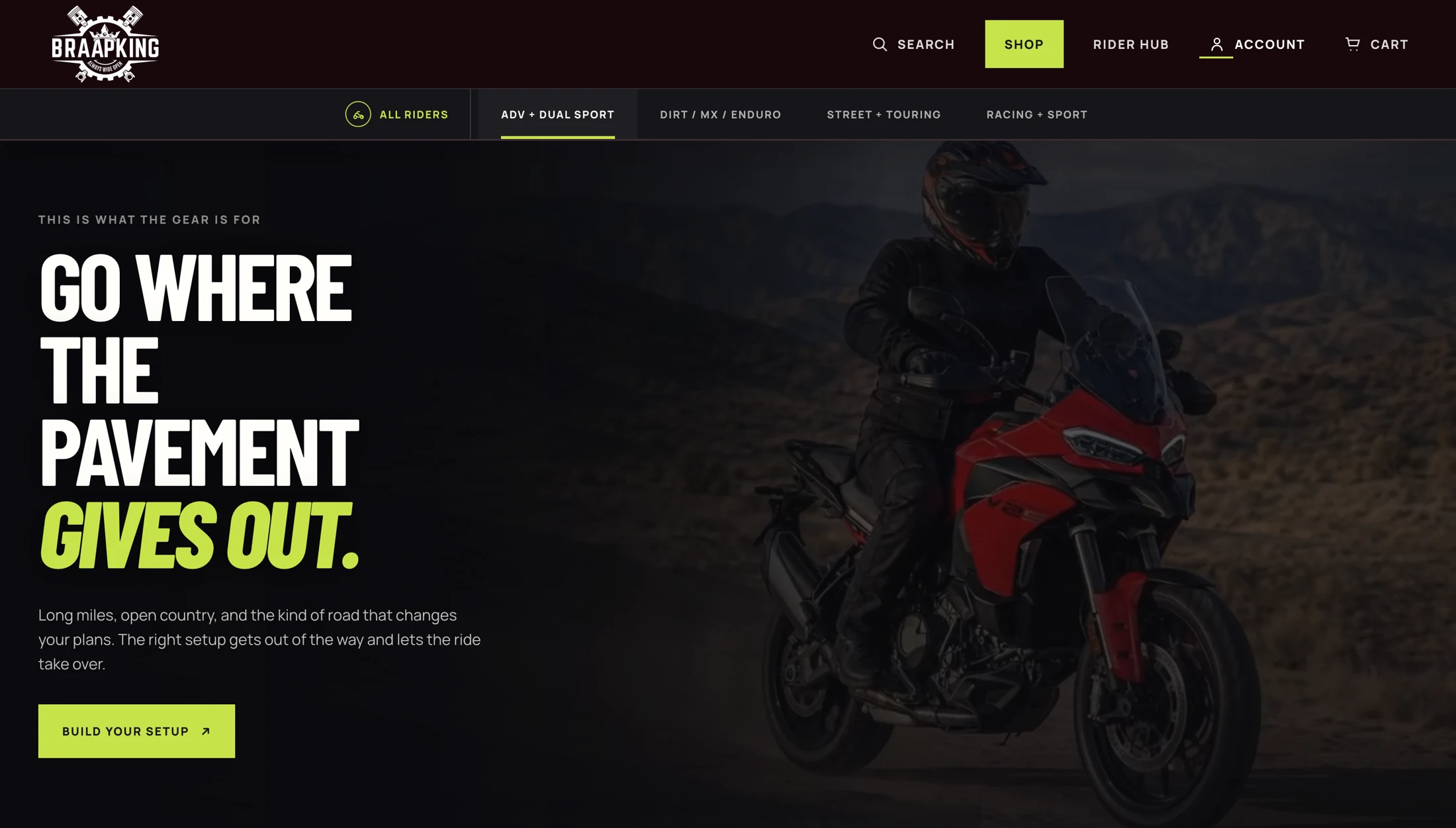
The dual-sport and street sections keep the same navigation and product-led composition. Their imagery and headlines change with the rider.
That consistency matters when someone moves between categories. They can explore a different kind of gear without having to learn a different store.
Buying guidance
Make room
for the questions.
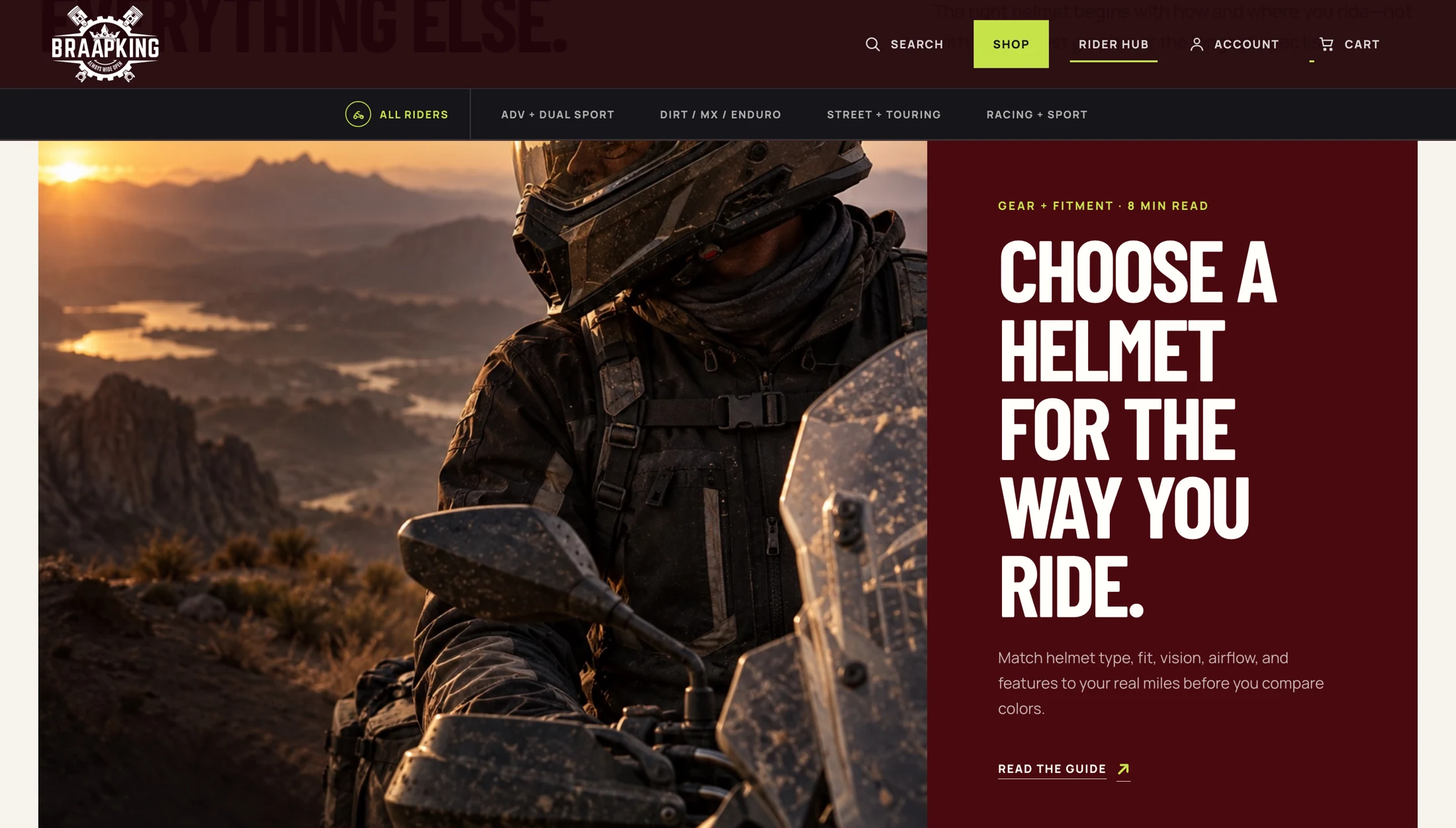
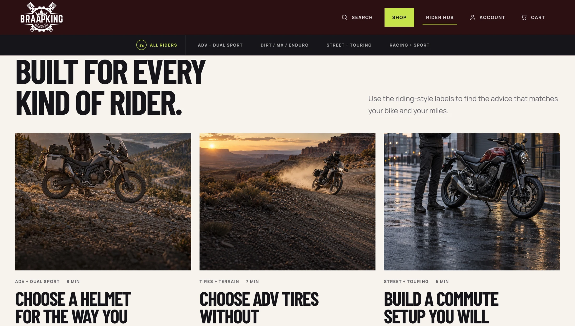
A rider who is still comparing gear needs more than a product grid. The journal gives buying guides their own place, with topics tied to the decisions made in the shop.
Helmet selection, adventure tires, and commuting setups become useful ways into the catalog. The editorial pages support the purchase without assuming the reader is ready to buy.
From browsing to choosing
Bring the details
into focus.
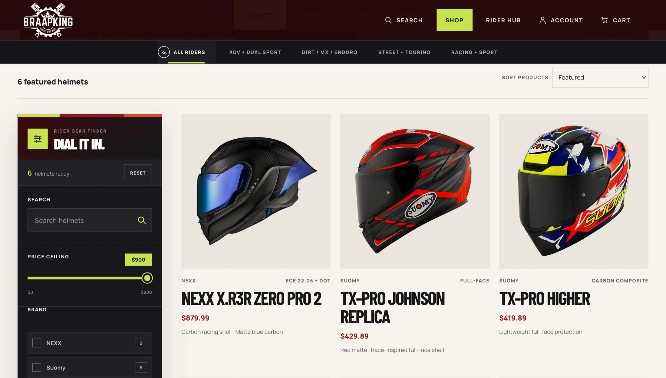
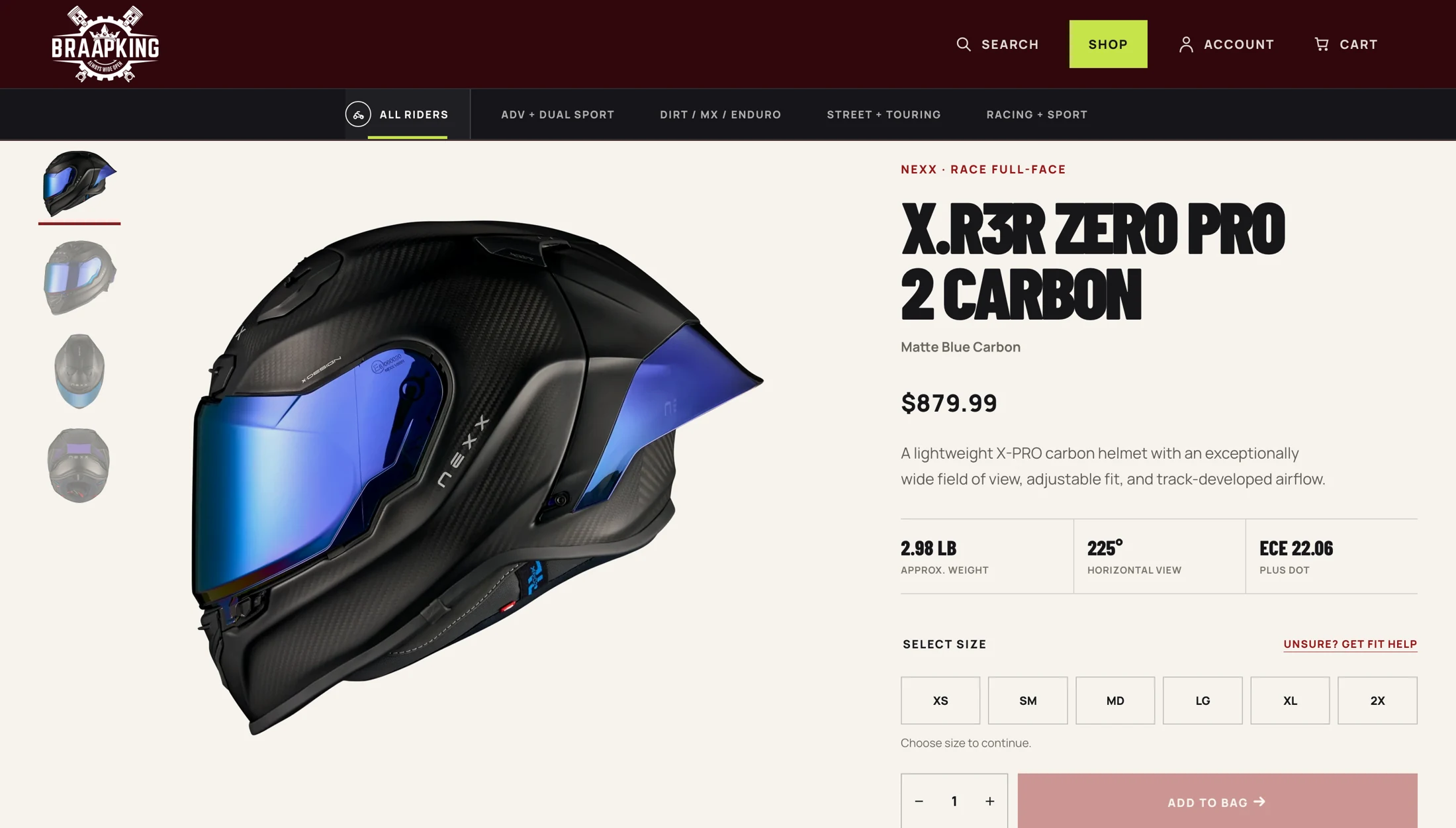
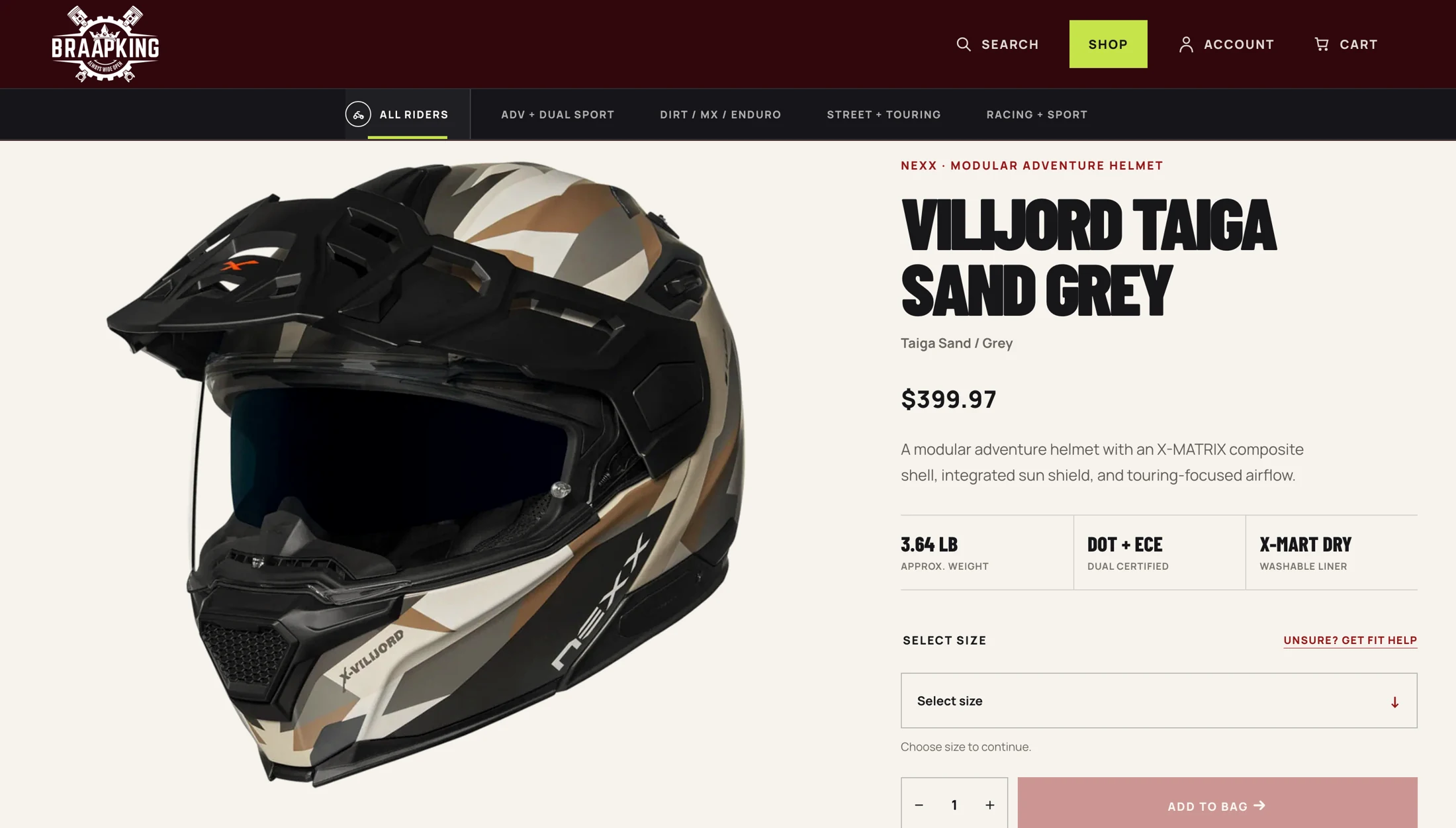
The catalog presents products beside a filter panel, with names and prices available in the grid. The product page then gives photography more space and brings size selection, specifications, and the purchase action together.
That change in scale follows the decision: compare several options first, then look closely at one.
What holds it together
Every route
leads to a choice.
The homepage establishes the brand, the categories narrow the range, and the guides help explain the differences. Product pages take over when the rider is ready to inspect an option.
That sequence gives the storefront its structure. The visual energy has somewhere to lead.
This study describes the supplied storefront designs and links to a review preview. It does not claim verified checkout functionality, product-fit accuracy, or measured sales results.
Explore the storefront
See the pieces
come together.
Visit the Braapking review preview to explore the storefront presentation.
Visit Braapking preview