Healthcare / Website design
Lexington Dentistry
A familiar face before the first visit.
Choosing a dentist comes with questions. This design for Lexington Family Dentistry makes room for the people behind the practice, explains the care available, and keeps the next step in sight.
Visit Lexington Dentistry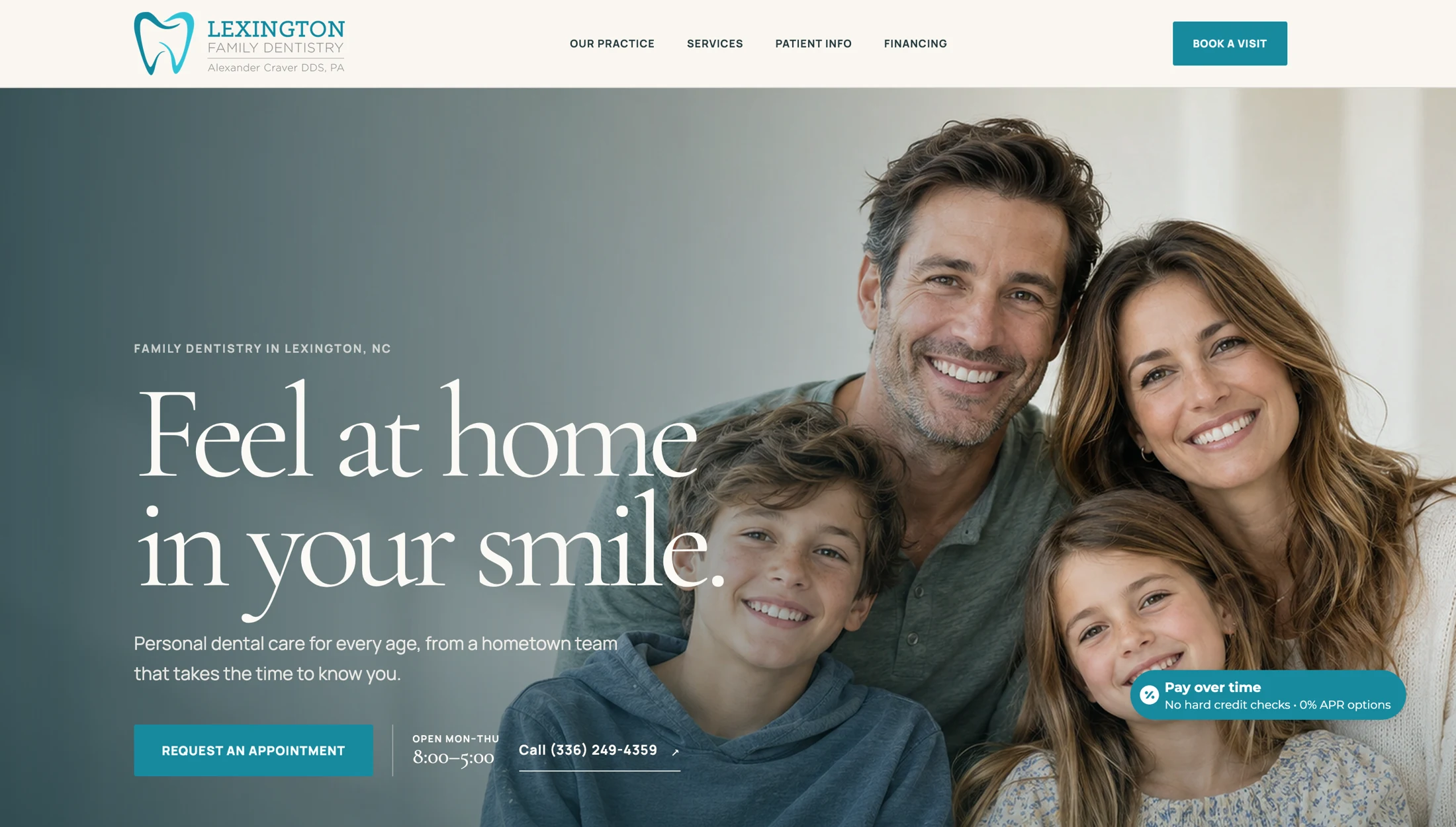
- The practice
- Lexington Family Dentistry
Lexington, North Carolina - Design focus
- Practice identity, treatment information, and new-patient guidance
- The patient journey
- Get to know the team.
Understand the care. Plan a visit.
The design brief
Help the patient
take the first step.
Who will I see? Can they help with what I need? What happens when I arrive?
The design addresses each question. Visitors can meet the team, read about treatments, and find the practical details of a first visit, with an appointment request close at hand.
The aim is a patient who arrives better informed. The design needs to earn that confidence a page at a time.
First impressions
A welcome with
somewhere to go.
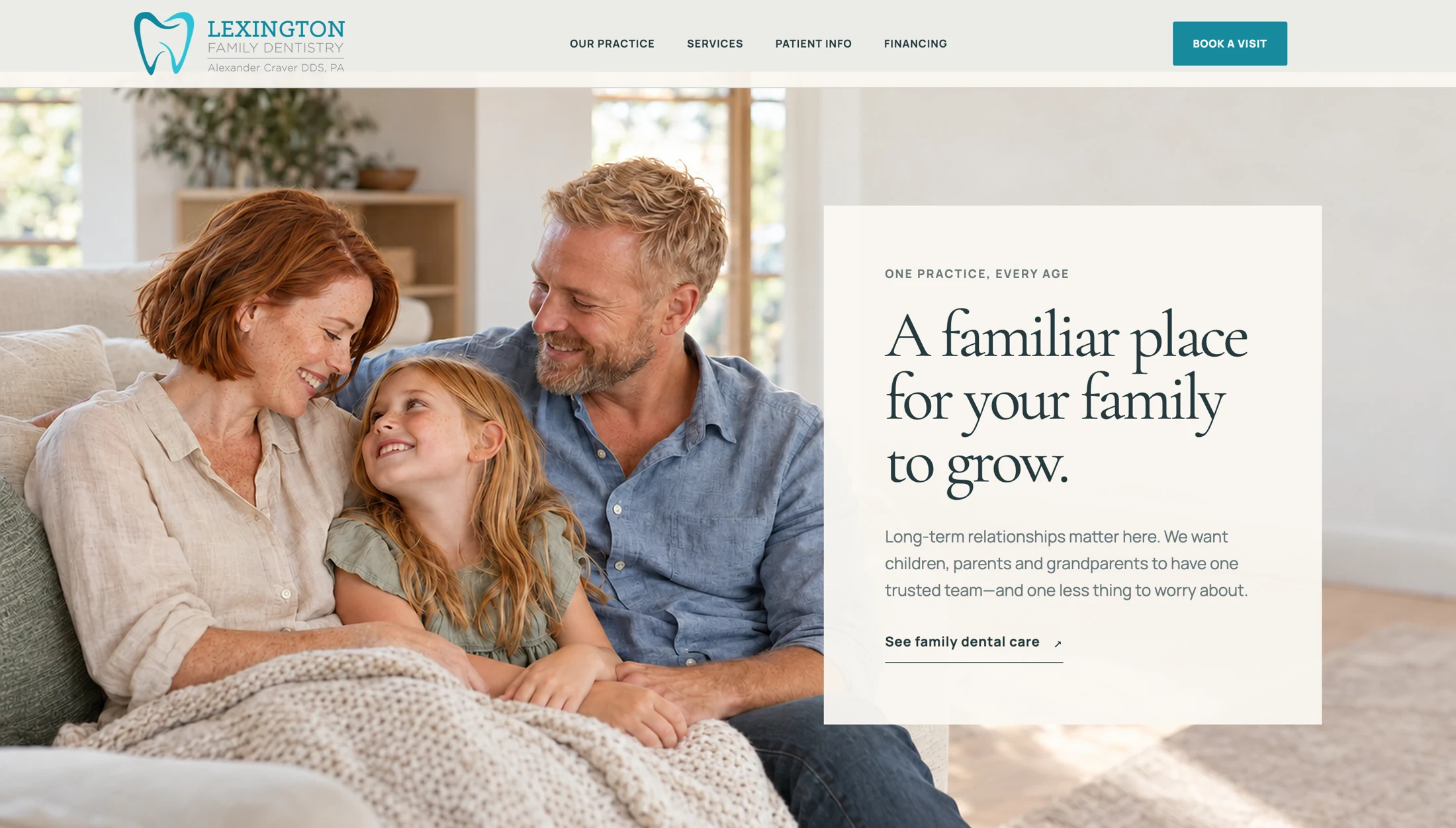
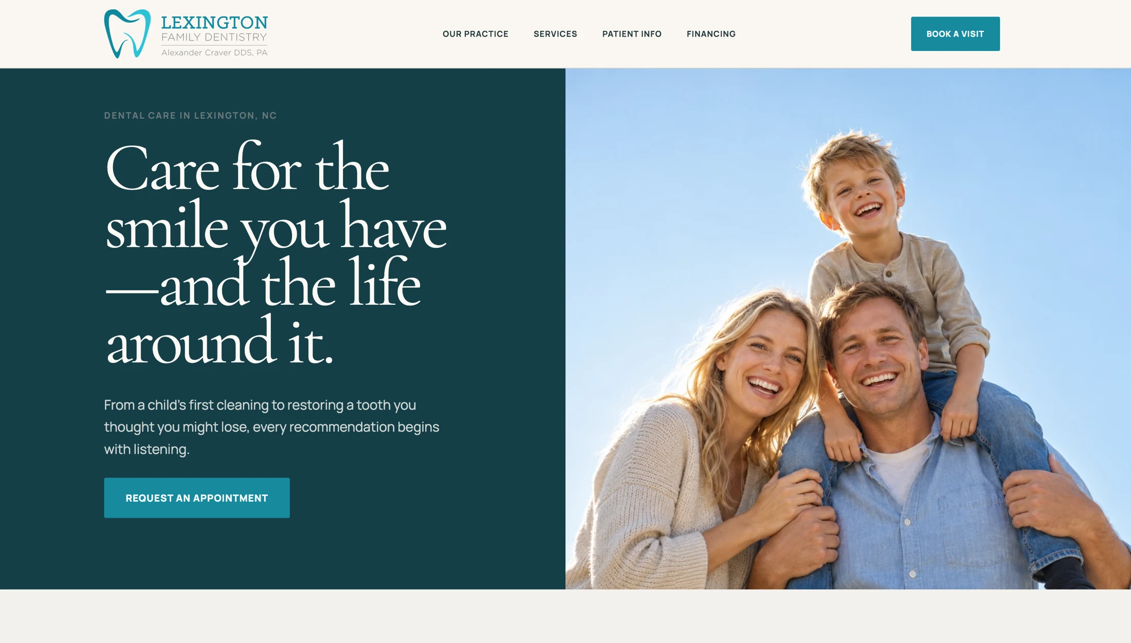
Family photography and a restrained blue-green palette set the tone. The homepage then gets practical: request an appointment, check the hours, or call the practice.
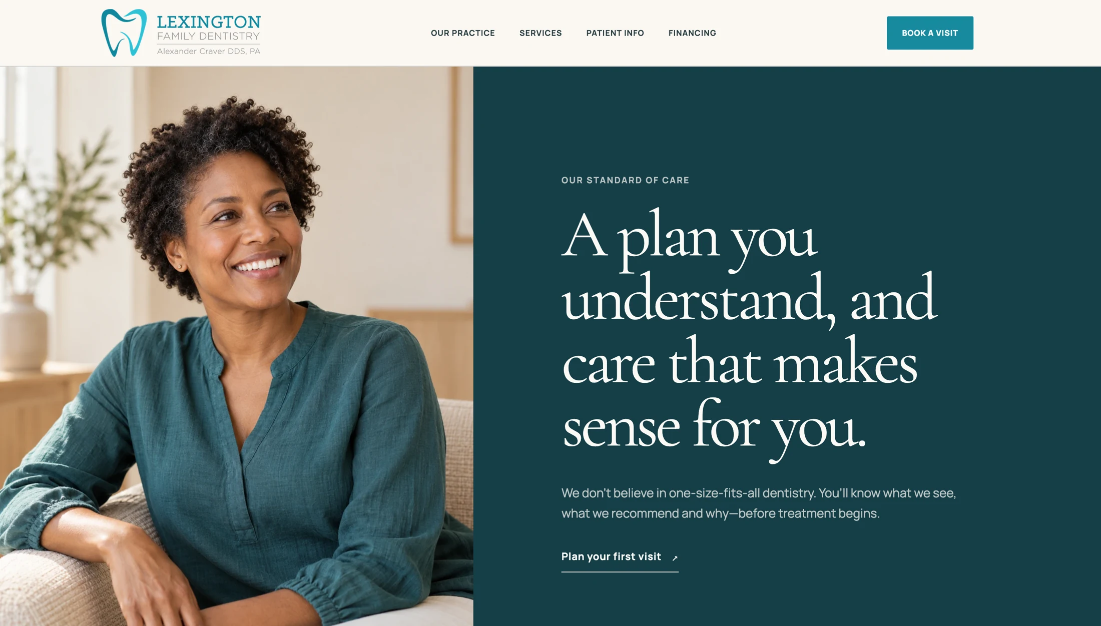
The care-plan section gives the visitor another reason to keep reading. Its message is plain: understand the plan before committing to treatment.
The people behind the practice
Put a face
to the name.
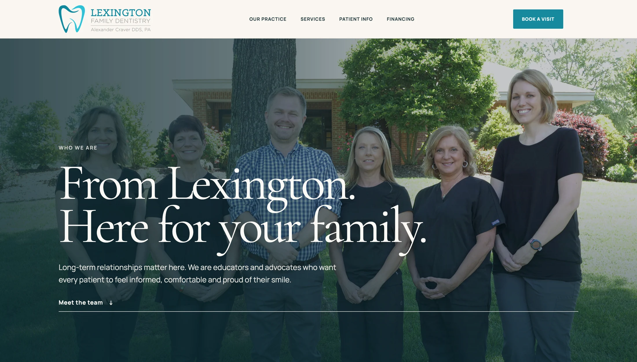
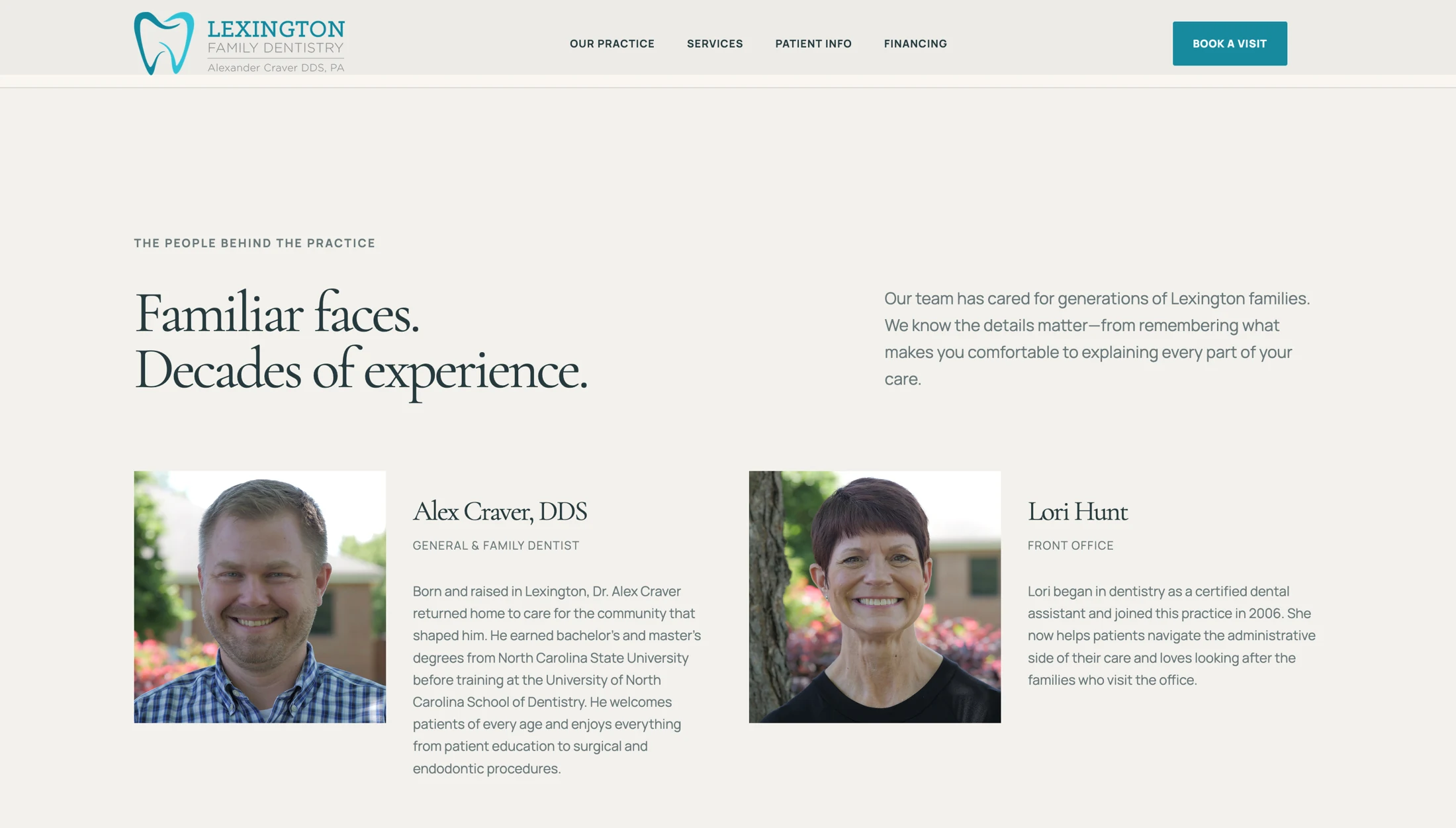
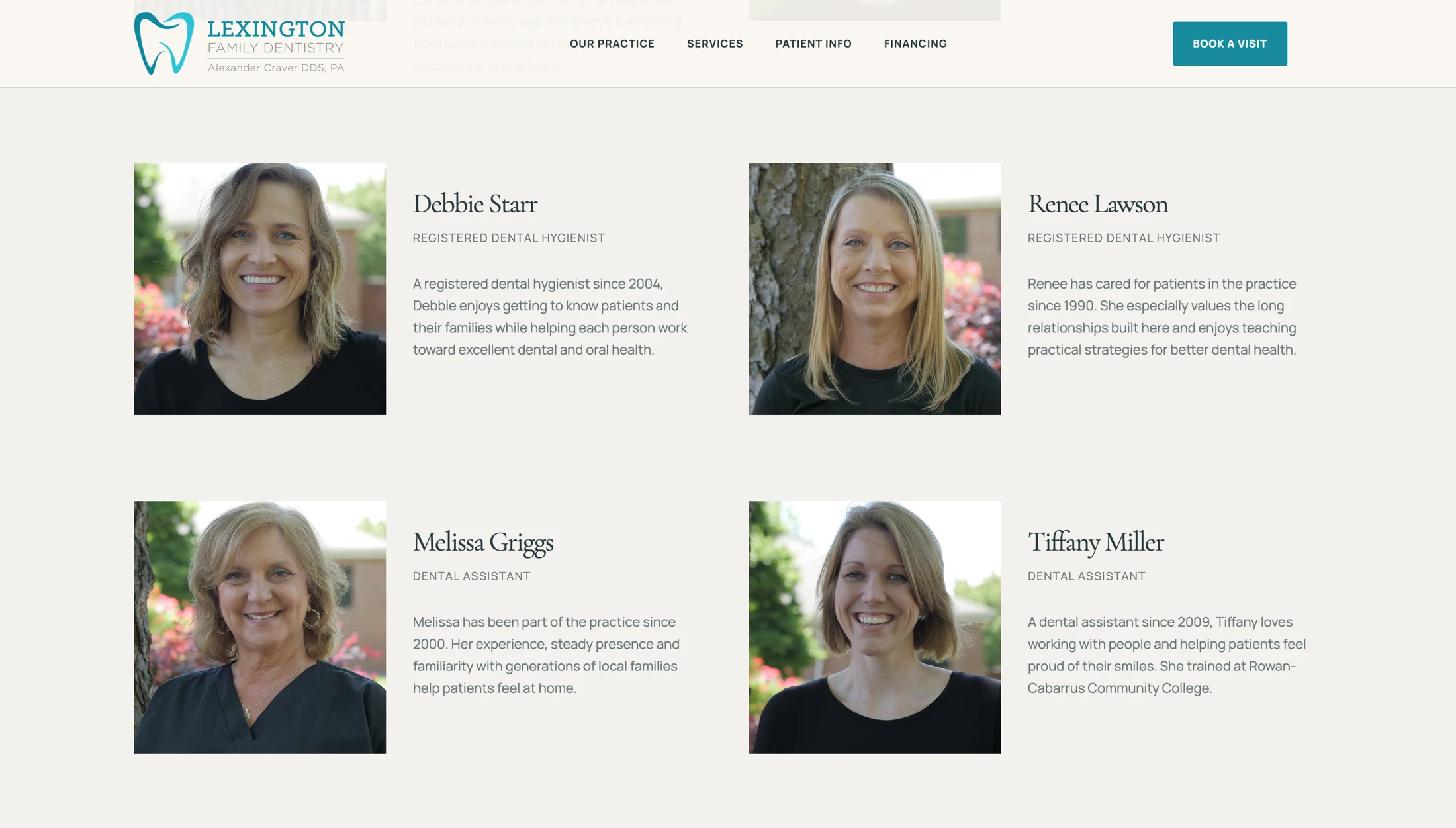
A list of qualifications cannot do the same job as meeting the team. The practice section opens with a group photograph, then makes space for individual portraits and biographies.
Patients can learn who they may meet without searching through a long page of undifferentiated text.
Treatment information
Explain the care.
Keep it readable.
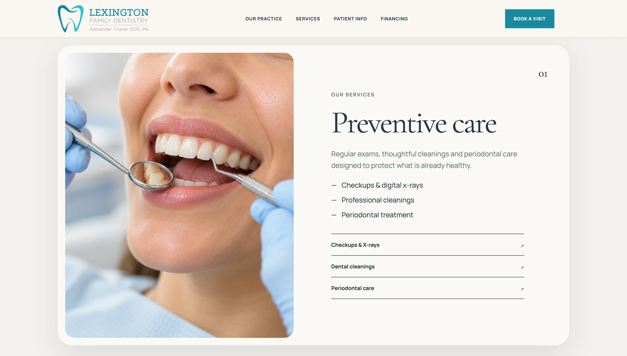
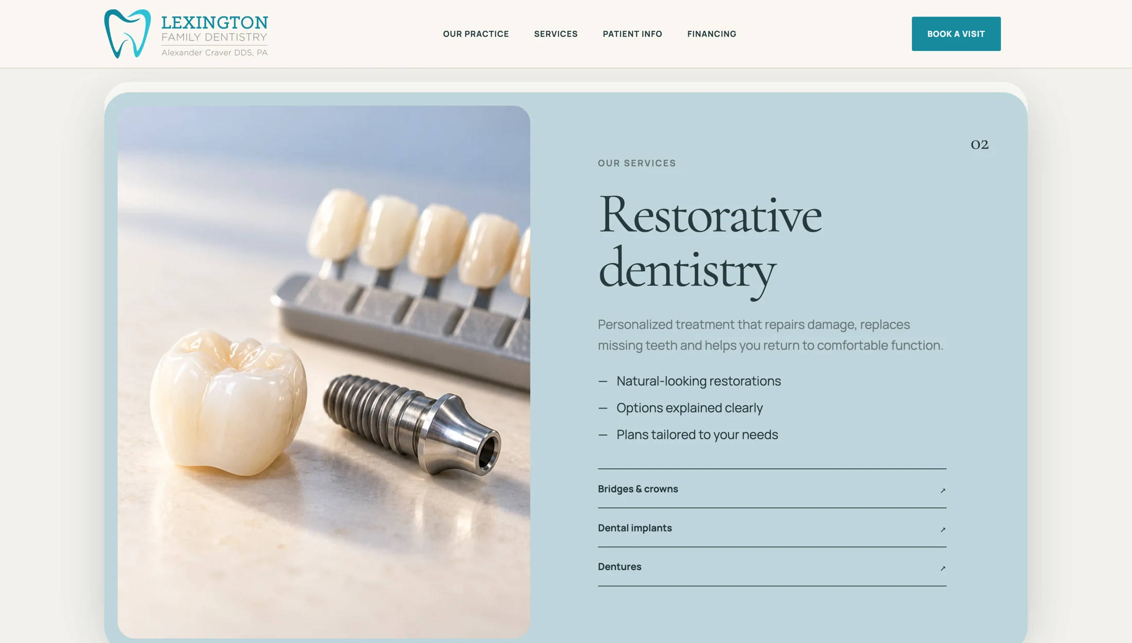
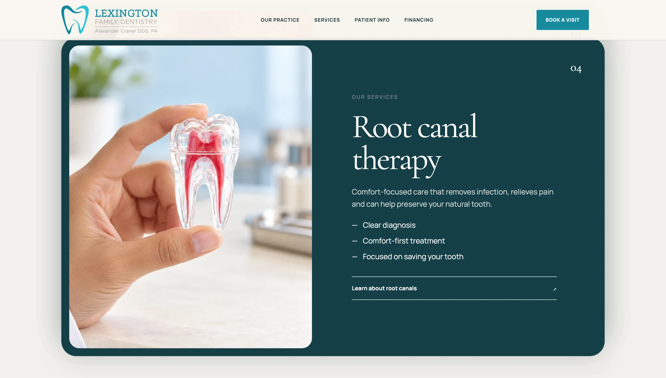
The service pages separate preventive care, restorative dentistry, and root canal therapy into distinct sections. Each combines a short introduction with expandable treatment details.
That structure lets someone scan for the service they need and read further when they are ready. It also gives each topic a defined place in the site's content, rather than burying everything under a single services heading.
View the services introduction
Before the appointment
Make the practical
details easy to find.
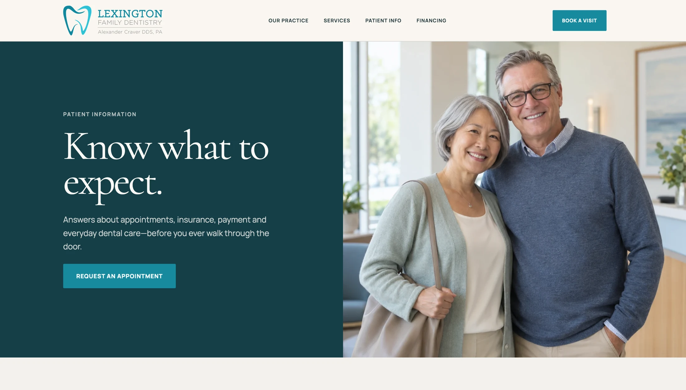
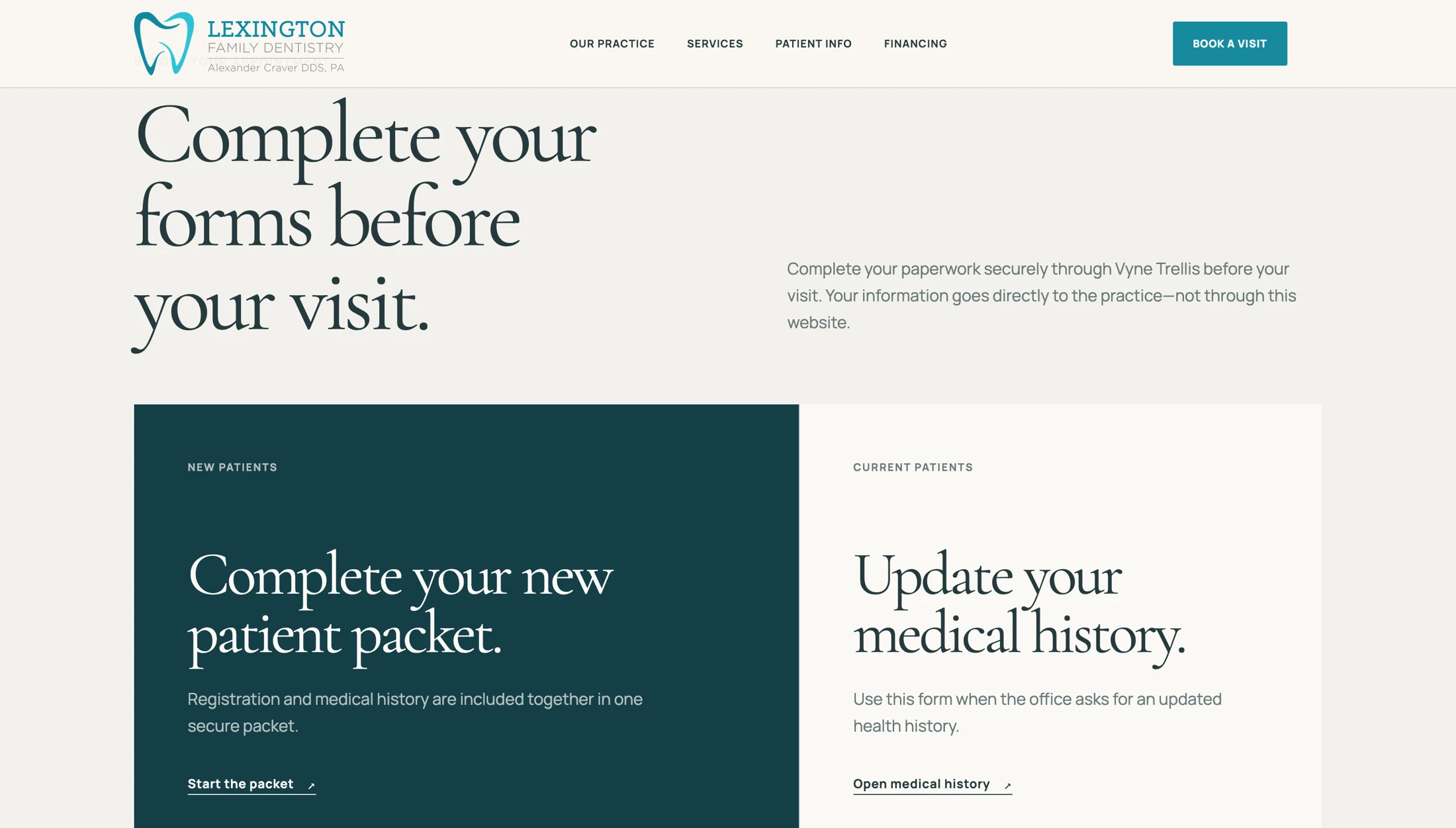
The patient-information section gives first-time visitors a place to begin. It introduces what to expect, then separates the new-patient packet from medical-history updates.
These details belong in the main experience. Someone preparing for a visit should not have to work through a marketing page to find the form they came for.
What the design brings together
A website that
helps people prepare.
The strongest thread is the order of information: meet the practice, understand the services, and find the details of a visit. The appointment request stays available throughout.
That is the work a dental website can do before anyone picks up the phone.
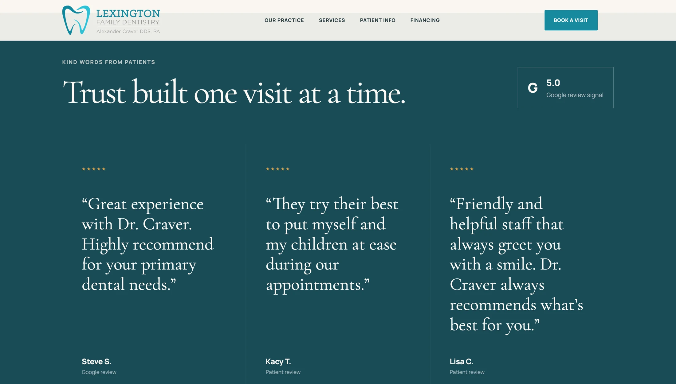
This study examines the supplied website designs. The goals and rationale describe design intent, not measured patient behavior or post-launch results. Review excerpts shown within the screenshots have not been independently verified.
Explore web designHave a website in mind?